Sean Parker
BA (Hons) Illustration
London College of Communication
sean.parker.27@googlemail.com
(+44) 07985 773109

9.5.09


A selection of drawings that I did of Hugh when we went to the Science Museum the other day. It was such a palaver trying to get to South Kensington, we had to take three different methods of public transport. We passed the time by doodling each other (sometimes without looking) in an attempt to strengthen our pen skills, but all that seemed to happen was that we drew attention to the fact we are socially stunted.

6.5.09

Fisherman's Wife

I've finished the entire specimen sheet for my font based on an octopus. I've already given you a little taster, but click on the post title or visit http://www.flickr.com/photos/sean_parker/3508477668/ to see the entire thing, as it wont let me upload it on this damn thing.

4.5.09

CLLGWRKSHP //


For our second Illustration workshop we were required to create three A2 collages; one symmetrical, one asymmetrical and one discordal.
Each had to involve three pictorials of modern architecture, three columns of text, a strapline (headline), three black squares of different sizes and a coloured geometric shape.

The symmetric attempt had to conform to balance, tradition and harmony, so I bided by the rule of three, which represents stability, and aids the centralising of images. This helped me to compose a spread that is both aesthetically pleasing in its linearity and striking mathematical.

When tackling the asymmetric collage, I was wary that it still needed to be rather stylized, save it resembling a mistake. By confronting the white space on the diagonal, it lends towards a more contemporary composition. The unbalance was created by concentrating much of the focus on the bottom third and juxtaposing the angular tesselation with less geometrically intrinsic shapes in the top third.

I'm not even sure about the third collage. Discord is hard to nail when, like me, you think too much.
Posted by Picasa

28.4.09

26MACHINES//


The start of our new typography brief saw us dive into a hands-on workshop where we had to create an alphabet in pairs from one of several silhouettes tacked to the wall. Naturally, Franny was my other half, and after hovering over the hexagon for some time, in what can only be described as a sporadic flash of absent-mindedness, I shotgunned the Octopus. Perhaps a little irrational, we thought as we sat down with the monochrome cephalopod, but within a matter of seconds, entire letterforms began surfacing.

Franny and I gave ourselves the stipulations that we could not add any external material or collage the tentacles to create the characters. We had to take the forms as we saw them, rendering the process more reliant on intuition and therefore making it more cohesive. The decision to keep a "long and jibbly" look throughout the font was partly due to the mesmerising tentacles and partly a subjective thing.


Having finished a first draft, scaling the dimensions up and down to experiment with legibility, we ground to a halt when it came to coining a name and spelling it out in the font. I was adamant I didn't want a pun put anywhere near or typeface, as I felt this would have ridiculed, what turned out to be a strong collaboration. We looked at biological names; Latin derivations and such (thanks Kirsten for wiki-ing 'octopus' on your iPhone) but came to the conclusion that when the word was long and polysyllabic, legibilty was shit and, due to the utterly non-uniform dimensions of the characters, it would kind of look like a 'joke' font, (see Billo or Hobo). LOL

"Sushi" briefly thought it had won, having been cut up and stuck next to the font. Unfortunately, it looked fuggin' awful. A mixture of upper and lower case sent the eye everywhich way, and more to the point, it didn't involve any of the best letters. Moreover, it just didn't suit the alternative nature of the finished font. Any suggestions would be greatly appreciated :)

We're still working on the name, and have agreed that it is lovely font to look at on the wall, possibly in a decorative frame, but it's going to struggle
when finding a suitable context for hypothetical publication. I can just see it looking so shit as a heading because the letters don't tesselate or justify well. I am just hoping we get a breakthrough with the name soon.

13.4.09

EASTERNZ //


My first real go at arty farty film photography.

7.4.09

FLICKR //

Other shit of mine over here.

DBLXPSR//


Some general photos from my first ever film that I found when cleaning my room.
Touch.

6.4.09

YUCUTAN //


In addition to the literary fodder shown in the last post, I bought this average looking book called "Yucutan and the Maya Civilization", just 'cause I was kinda interested in the cover (pretty shallow, me). Got it home and it's full of pretty much the most amazingly vivid photos of the Mayan pyramids and tombs built all over the Mexican city. I've looked into it a little, and have found that it is quite a spot for backpackers. Now, I've never been one for travelling but I NEED TO SEE THESE BEFORE I DIE OR AT LEAST BEFORE I HAVE KIDS. It's something about the mesmeric symbolism of the temples; the perfect symmetry, the picturesque landscape, and just the sheer enormity of their majesty. Unbefuckinglievable.

NEWPURCHASES//


Okay, so I can't honestly remember the last time I bought myself some clothes or something really expensive, so I do tend to wonder where all my fucking money goes. Then I realised my bookshelves, warping under the weight of old paper. I buy books by the shed load. Some because they have beautiful covers, others because of the sentimental ties to a past life, but most because I believe that one day they will come in handy for a collage or as reference in a project. Either way, I've told you before that I am a proud hoarder. Have a look at these beauties (obviously not nearly as impressive as the gems Ms Melford-Colgate brought back from Berlin) but just assess them. You can't tell me this was not £1.24 well spent. Suck it in.

30.3.09

"Brick's Got Talent"

- Justin Bailey. copyright 2009


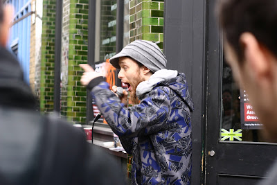
Yesterday, after having completed 4 zines for CLINIC, Sam (Bore Dubz) and I went to Brick Lane in search of a shop who would be willing to sell our zine. The day definitely started with the longest bus journey ever. Everything was everywhere. I felt like I was on the Truman Show and there was a conspiracy to annoy me with traffic and various J-walkers.
But, when we got there, I had a bangin' bagel. So I was happy again. We walked to Concrete Hermit 'cause I definitely believed I had been there on a Sunday before. The grey shutters told different. But, whatever, there must be loads more zine shops around here, we thought. Wading through the current of tourists, like salmon swimming upstream, with the homeless bears pouncing on anything even slightly alive, we found Lik + Neon.
Okay, now I'm pretty open minded; I'm not quick to judge and I've seen some weird shit in my life, but in this shop I had, by far, the STA-RANGEST experience in a long while. I assess the fluorescent colour scheme and brace myself for a zany lesbian with pink hair, who won't stop talking over me. I creep through the door and am accosted by not one, but TWO CATS. At first, I thought they were strays that had invaded the shop until the professional looking woman behind the counter picked one of them up and began conversing with it in her soft South African accent. She wore a fawn tunic and had a strawy brown mane. Pretty much the antithesis of what I expected.
I had a quick look around and then enquired about the zines she sells.
I explained our pamphlet and our roles, praised her shop, asked about the other zines, and even went to the trouble of getting one of ours to show her, so I was completely baffled when she cocked her head to the left and just smiled drunkly. We stood there, forcing half-smiles in utter silence for at least 30 seonds. And this just completely freaked me out. And it wasn't even like she was just shy. Her eyes looked empty.
I eventually realised this transaction was dead still and so just sort of sidled out of her line of sight, while she continued to run around the shop after her cats. I still have all the zines. I'm going to head back to 'Hermit when I get a chance. Apart from the surreal conversation with Cat Lady, I had quite a pleasant couple of hours. Everyone and their damn dog was there, though. You couldn't even move for the pure volume of barbours and brogues. The street vendors were definitely best value for money, as most of them could not count, which meant i got a hat, a magazine and this snazzy (and pretty retarded) camera for £8.21 instead of £13. Outrageous.