Design an A1 poster about the an everyday object. Explore the object, record sights, sounds, smells. There are no limitations to what you do, just make sure you teach the viewer something they didn't know.
This is my first draft. I was trying to work towards something quite factual and witty, but i wanted to retain a sort of naive feel. I mean, after all, it's just an apple, there's no point overcomplicating things. I wanted to start with a big title to grab the attention of the viewer. By claiming that what they were looking at is not an apple, it instantly makes them question their own judgement, and so intrigues them to read on etc. The idea behind the reducing text was that i wanted the viewer to properly take notice of what was written. But then i realised it was a wank idea because Photoshop just does not have the ability to sort out the kerning and justification.
29.10.08
27.10.08
Using a continual line drawing of a typewriter I did as the starting point, i looked at layering and opacity as possible ideas for the front cover of the zine, based around the theme of the resurgence in popularity of charity shops.
The first is an idea based around 3D interaction. I had bought many a pair of those crappy 3D glasses in charity shops purely for the fact I can't find them anywhere else. Making something appear three dimensional add an element of fun to a flat page.
The second draft focusses more on the passage of time, in terms of decay and trend. By fading out the illustration, the picture acquires a sort of romantic feel. The type, using Century Schoolbook ( a current favourite of mine), I employed the right range for title and justified the subheading, concentrating on the kerning and the unorthodox white space. It looks nice, naugh?
26.10.08
Self-initiated project.
I haven't written on here for quite a while, now. I'm getting worried because you can't normally stop me talking, and even my average days are pretty eventful, so, in theory, I should have a tonne to ramble about. And I do, but I always seem to get distracted from tapping down my thoughts by a number of things; primarily the fact that I live in what has repeatedly been described as a zoo, and secondarily the horrific admission that everytime I hook up to the internet I get lured into the social pit of doom that is Facebook.
Now, following the modest success of our zine project, we have acquired a block of free time until the beginning of the typography workshops. Being somewhat of a work whore, I find myself fretting when I have nothing to do. If you know me well enough, I'm sure you are aware that one of my (many) faults is that I am possibly the most impatient human being ever to walk the Earth. Oh, don't worry, it's fine when others are waiting for me (I'm usually the last one to be ready for anything, whether it were breakfast or my own fucking funeral) but as soon as I'm ready, out she comes; this nagging old bag, with a penchant for safety.
Hugh and I (more commonly known as ShoeHorn) have decided to undertake a project of our own. The obvious starting point for the subject matter is something that we both are passionate about and can comprehensively babble about for an extended period of time.
Boat shoes...
Typewriters...
Plaid shirts...
Hang on a second...
In the (slightly modified) words of the exceptional spectacle of childhood paraphernalia AKA Toys'r'us...
"There's millions of giblets all under one roof,
It's called Chazza Shops,
Chazza Shops,
CHAZZA SHOPS"
So, ladies and gentleman, tramps and nuns, allow me to introduce you to the Charity Shop Zine.
Preliminary sketches are obviously a must. Take a shneaky peak.


22.10.08
21.10.08
19.10.08
15.10.08
Streetzinemockup.


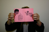
Our zine is coming on nicely; now have a prototype, made in the cut-up collage manner.
We're not quite sure of the name yet, but we are pondering over both look, see. and looksey.
I think the content is varied and visually stimulating, while simultaneously portraying both
our group identity and our individual personalities. Let's strike the balance.
12.10.08
10.10.08
Subscribe to:
Comments (Atom)


